I chose to focus on taste as my sense of choice. First image I picked the word spicy, I used a lava effect to add a sense of heat to the image. For salty I layered an opaque layer of waves over the pretzels to emphasis the salty taste. Rich was more about texture and taste combined, I made the image dark and chose a chocolate cheese cake which really gives that thick and full of flavor feeling. Finally for Sweet I wanted the image to be cute and playful like the word itself, so I chose an image with different colors of ice cream and used a sparkle brush to give it a little extra sweetness. To bring the image of taste together I finished with a curving design, where each curl connects to another all following a line of small black dots. Taste can be simple like the black dots but it also dances on your taste buds like the designs of the curls.
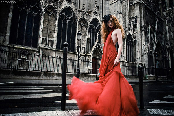
When guiding a viewers eye to the focal point while using the method of contrast, the creator uses a bright color that stands out against the dull background. In this case, the model is wearing a bright red dress that stands out from around the dull gray hues around the the focal point. Because of this contrast the viewers eye is drawn to the dress and the model wearing it.
Isolation
zemotion on Deviant Art
The pattern in this image is crazy but the eye is quickly drawn to model in the top right corner of the piece because she stands out from the pattern. When the eye is drawn to a focal point using this method it is called isolation, the creator draws attention to a point by making it different from the rest of the piece.
Placement
photographic.com
The wind mil in the center of the photograph is sure to catch attention from the viewer but it is the leading lines in the red fields below it that keeps directing the viewers eye back to it. Placement focal point is when the elements of a piece all point or redirect the eye to one point of interest.
One element
zemotion on Deviant Art
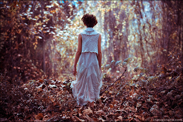
The dead leaves are contrasted by a bright single person in white. The eye is drawn to her because of a different texture, color, and placement. This one element stands out against the rest, something bright and alive as opposed to the forest of fallen dead leaves.
Absence of focal point
flickr
Sometimes an artist may choose to emphasis the entire piece as a whole, therefore having no particular focal point. The image above is a continual pattern, the eye is not drawn to any one point in the image, it is free to roam as it pleases.
When elements of a piece are placed closer together to complete composition this is known as proximity. If the elements, in this case the circles, were arranged differently the piece would have a different feeling and look. This piece feels balanced to me, it slowly fades from solid pink to white by the proximity of the bubbles.
Repetition (emphasis on similarity)
Repetition is the repeated element in a piece of art, in this piece it is the spheres aligned in a row. One great thing that the repetition in this piece adds to the competition is it creates a depth of field. Some piece that use the same element for repetition seem too obvious to me, like blocks of different faces, or straight rows, what I loved about this piece is it adds to the competition rather than commanding it.
Repetition (emphasis on variety)
Like the image of the repeating spheres this image is also one of repetition, however, the elements in the image are not quite the same. The different patters on the butterfly shape adds variety but still keeps the unifying look of repetition.
Continuation
When a line flows through a design the piece has continuation, in this piece that line is the railing of a stairwell. The angle the image was captured is interesting and adds a unique look to the image as a whole, it almost appears to be like an eye.
The grid as organizing factor
Elements of a piece are aligned in rows and columns and together this creates the composition of the piece of grid art. This piece of art combines many layers of grids to create the image of a person sitting, the way the grid is set up creates a 3D effect.
An example of a chaotic, unreadable image
The lines on this image are so chaotic it doesn't immediately make you see a face, but the artist somehow manage to create one within all the "scribbles". All the elements of this piece come together nicely even though there is so much going on.
An example of a non-objective expression of unity
This image could also be used as an example of proximity but to me I think it is a good representation of non- objective or abstract art. The colors and different shapes look chaotic and explosive but unite into one piece and work well.
An example of a figurative expression of unity
Expressionism is an art style about emotions, it is portrayed as an exaggerated or distorted realism to provoke the emotion the artist is trying to express. I really loved this image because of the colors but mostly because of the element of music. Music is something that is universal and even if you cant understand the lyrics you can still feel the message; its a universal outlet for expressing oneself.
Sunday, January 27, 2013
I love Art that makes you stop and think. If it makes me wonder "What kind of sorcery was used to create it" than its really amazing to me. I love pieces that have a message as well, the more thought it provokes the more intriguing it is. During a drawing class I discovered that my ability wasn't as bad as I had thought but I'm not a drawing artist! So I love pieces where people are able to draw so well you question if it a photograph or not.